

Table of contents
Box Model
The CSS box model is essentially a box that wraps around every HTML element. It is a container that contains multiple properties including borders, margin, padding, and the content itself, which are used to create the design and layout of the web pages.
The following diagram illustrates the box model.
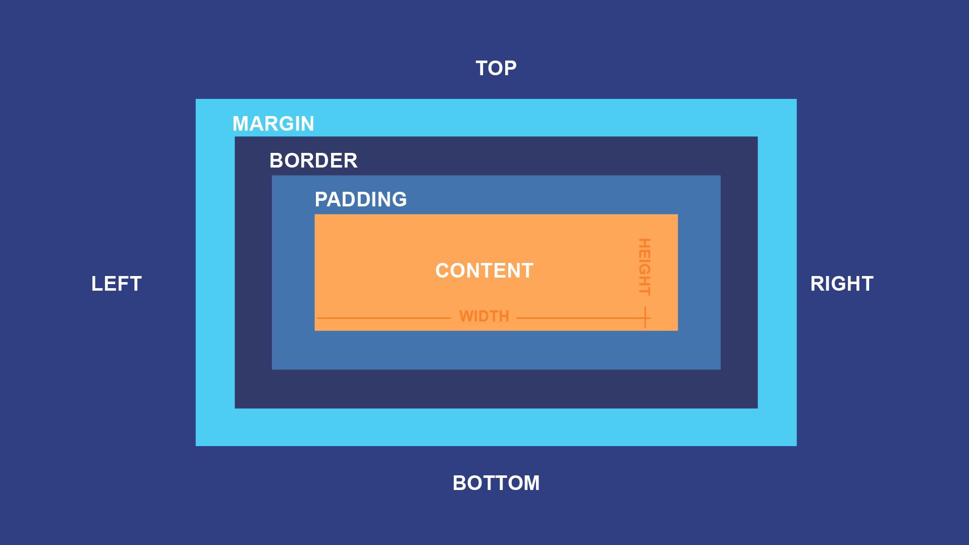
- Content
The content area consists of content like image, text, or other forms of media content. The height and width properties help to modify the box dimensions.
- Padding
This padding area is the space around the content area and within the border-box. Its dimensions are given by the width and height of the padding-box. It can be applied to all sides of the box or to the specific, selected side - top, right, bottom, and/or left.
- Border
The border area surrounds the padding and the content, and can be applied to all the sides of the box or to selected side - top, right, bottom, and/or left. Its dimensions are given by the width and height of the border.
- Margin
The margin area consists of space between border and margin. The dimensions of the Margin area are the margin-box width and the margin-box height. It is useful to separate the element from its neighbors. It can be applied to all sides of the box or to the specific, selected side - top, right, bottom, and/or left.
Media Query
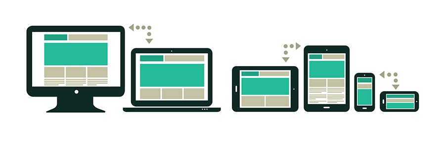
Media queries allow you to customize the presentation of your web pages for a specific range of devices like mobile phones, tablets, desktops, etc. without any change in markups. A media query consists of a media type and zero or more expressions that match the type and conditions of a particular media features such as device width or screen resolution. The display is adjusted according to certain conditions such as media type, screen orientation or screen resolution.
An essential part of responsive design is creating the right user experience for each type of device. The big advantage of CSS media queries is that appropriate resolutions and screen sizes do not have to be specified for each individual device. CSS media queries thus offer an easy way to align web pages to more than one type of output device.
Syntax
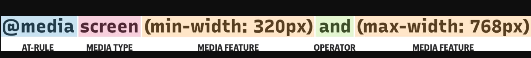
- @ media
Media Queries start with the "@ media" declaration. The main purpose of writing this is to tell the browser that we have specified a media query.
- Media Type
This is used to specify the nature of the device we're working with. The four values are:
all - Matches all devices.
Print - Matches documents that are viewed in a print preview or any media that breaks the content up into pages intended to print.
Screen - Matches devices with a screen (Computer screens, tablets, smartphones etc).
Speech - Matches devices that read the content audibly, such as a screen reader.
- Media Feature
Once we define the type of media we’re trying to match, we can start defining what features we are trying to match it to.
Width - Defines the widths of the viewport. This can be a specific number (e.g. 400px) or a range (using min-width and max-width).
/* Exact width */
@media (width: 440px) {
    //styles
}

/* Minimum width */
@media (min-width: 380px) {
  //styles
}

/* Maximum width */
@media (max-width: 780px) {
  //styles
}

/* Targeting screen sizes between 480px & 768px */
@media (min-width : 480px) and (max-width : 768px) {
  //styles
}
Height - Defines the height of the viewport. This can be a specific number (e.g. 400px) or a range (using min-height and max-height).
/* Exact height */
@media (height: 440px) {
    //styles
}

/* Minimum height */
@media (min-height: 380px) {
  //styles
}

/* Maximum height */
@media (max-height: 780px) {
  //styles
}

/* Targeting screen sizes between 480px & 768px */
@media (min-height : 480px) and (max-height : 768px) {
  //styles
}
aspect-ratio - Defines the width-to-height aspect ratio of the viewport.
/* Minimum aspect ratio */
@media (min-aspect-ratio: 8/5) {
  //styles
}

/* Maximum aspect ratio */
@media (max-aspect-ratio: 3/2) {
  //styles
}

/* Exact aspect ratio, put it at the bottom to avoid override*/
@media (aspect-ratio: 1/1) {
  //styles
}
orientation - The way the screen is oriented, such as tall (portrait) or wide (landscape) based on how the device is rotated.
@media (orientation: landscape) {
  //styles
}

@media (orientation: portrait) {
  //styles
}
- Operator
Operators can be used to compose a complex media query: 'not', 'and', and 'only'. You can also combine multiple media queries into a single rule by separating them with commas ( , ).
and
The and keyword combines a media feature with a media type or other media features.
@media (min-width: 760px) and (orientation: landscape) {
  //styles
}
This example combines two media features to restrict styles to landscape-oriented devices with a width of at least 760px.
@media screen and (min-width: 30em) and (orientation: landscape) {
  //styles
}
or ( , )
You can use a comma-separated list to apply styles when the user's device matches any one of various media types, features, or states.
@media (min-height: 680px), screen and (orientation: portrait) {
  //styles
}
The rule will apply its styles if the user's device has either a minimum height of 680px or is a screen device in portrait mode.
not
The not keyword can't be used to negate an individual feature query, only an entire media query.
@media not all and (monochrome) {
  //styles
}
The above query is evaluated like this.
@media not (all and (monochrome)) {
  //styles
}

/* It wouldn't be evaluated like this */
@media (not all) and (monochrome) {
  //styles
}
only
The only keyword prevents older browsers that do not support media queries with media features from applying the given styles. It has no effect on modern browsers.
@media only screen and (color) {
  //styles
}
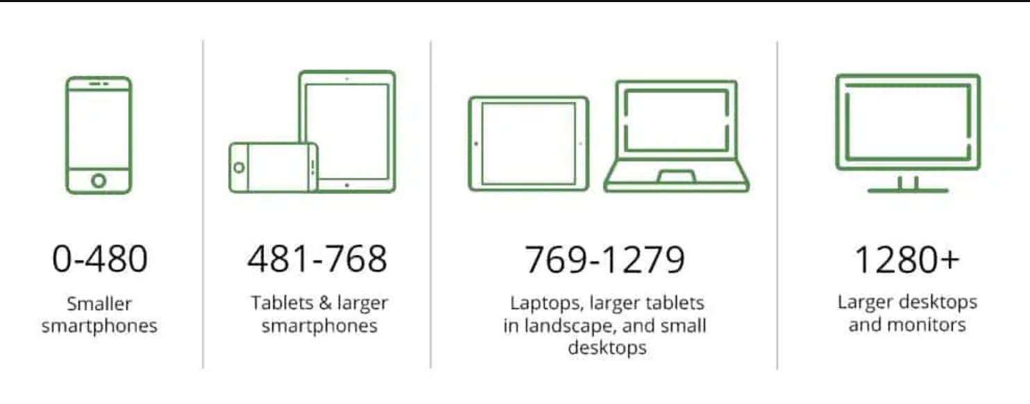
Breakpoints in media queries
A breakpoint is a condition that results from media queries that changes the layout of a web page at a particular display size.
Some common breakpoints for devices with different screen sizes are:
320px — 480px: Mobile devices
481px — 768px: iPads, Tablets
769px — 1024px: Small screens, laptops
1025px — 1200px: Desktops, large screens
1201px and more — Extra large screens, TV