

Table of contents
Flex Box
The flexbox or flexible box model in CSS is a one-dimensional layout model. It allows to arrange and organize the webpage horizontally or vertically, which makes the webpage easy to understand and beautiful.
Flexbox helps in creating flexible and responsive layouts where we can adjust the flex items within the flex container.
Terminologies
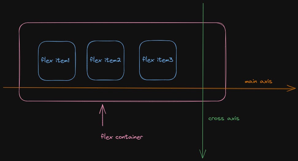
- Flex Container - Flex container is used as a container for the flex-items. To make the container flexible, we set the display property as flex. The parent which contains various divisions (flex items) is called a flex container.
- Flex items - The items inside the flex container are flex items. They are the children of flex container.
- Main Axis - The main axis is the one set by your flex-direction property. If that is row your main axis is along the row, if it is column your main axis is along the column.
- Cross Axis - The cross axis runs in the other direction to the main axis, so if flex-direction is row the cross axis runs along the column and vice-versa.
Properties
Flexbox possesses various properties where some properties are applied to the flex container (parent) while some are applied to the flex items (children).
- Display
Apply a display type of flexbox to the flex container (parent), this would make all the child elements (flex items) in it to adjust into the flex type.
display: flex;
- Flex Direction
Flex-direction is used to set the orientation and direction of the flex items. Flex direction property have four values - row (left to right), row-reverse (right to left), column (top to bottom), column-reverse (bottom to top).
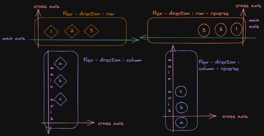
flex-direction: row | column | row-reverse | column-reverse;
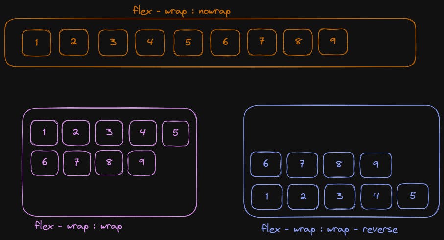
- Flex-Wrap
Flex-wrap defines the arrangement of flex items in a row that should wrap or not. It takes the following values: -
wrap - flex items will wrap onto multiple lines, from top to bottom.
nowrap - This is the default value that means the items will not wrap.
wrap-reverse - flex items will wrap onto multiple lines from bottom to top.
flex-wrap: nowrap | wrap | wrap-reverse;
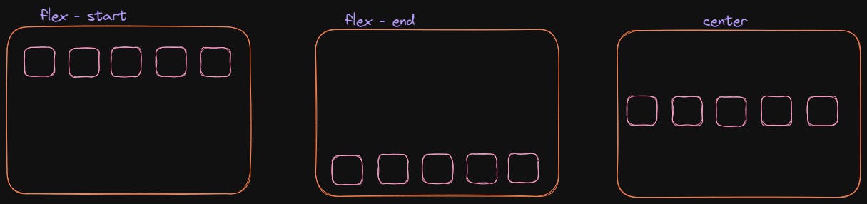
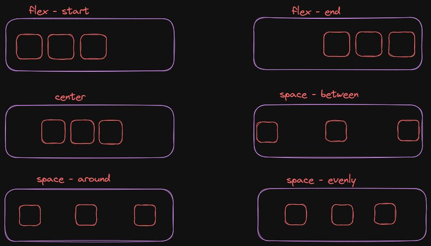
- Justify-content
Justify-content allows you to align flex-items along the main axis. It defines the distribution of space around the flex items along the main-axis of the flex container. It takes the following values - start, center, space-between, space-around, space-evenly.
justify-content: flex-start | flex-end | center | space-between | space-around | space-evenly;
- Align-items
Align items are used to align flex-items along the cross-axis. It takes the following values - start, end, stretch, center. The initial value for this property is stretch and this is why flex items stretch to the height of the flex container by default.
align-items: stretch | flex-start | flex-end | center;